How to cope with the Gmail redesign
April 21, 2012 · 1 min read
Reports are coming in from around the Internet that the Gmail redesign, which we were previously able to stave off with "revert to the old look temporarily", is now forcing itself upon us. I too have succumbed to the new design, and have been forced to find ways to cope. Here's what I did to make it semi-bearable:
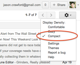
Display density: Compact
The default is lousy information density; too much screen real estate wasted in blank pixels. Fix it like this:
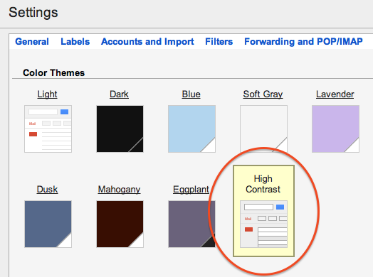
Theme: High Contrast
The "High Contrast" theme is Gmail's grudging admission that its design is too low-contrast. Find it under Settings > Themes:
Importance markers: No markers
I don't use Priority Inbox, but I do star a lot of messages. They're right next to each other and they're exactly the same color, so I have a hard time telling them apart:
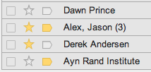
You can get rid of the "importance" markers under Settings > Inbox:

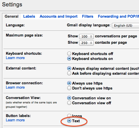
Button labels: Text
Here are the new Gmail action buttons. Quick, what does each one do?

I find these icons hard to parse—too minimalist/iconic. (Worse, the buttons only show up when you have a message selected. But there doesn't seem to be a way around that.)
You can turn the icons into more understandable text labels under Settings > General:
Disable "web clips"
If you didn't do this years ago, do it now. The new design is hard enough to parse without news links and ads getting in your way, and you can't even customize web clips anymore, which maybe is Google's way of saying that even they don't want you to use them. Besides, when you're in your inbox, you should be focused and productive, not distracted by random links. Disable web clips under Settings > Web Clips:

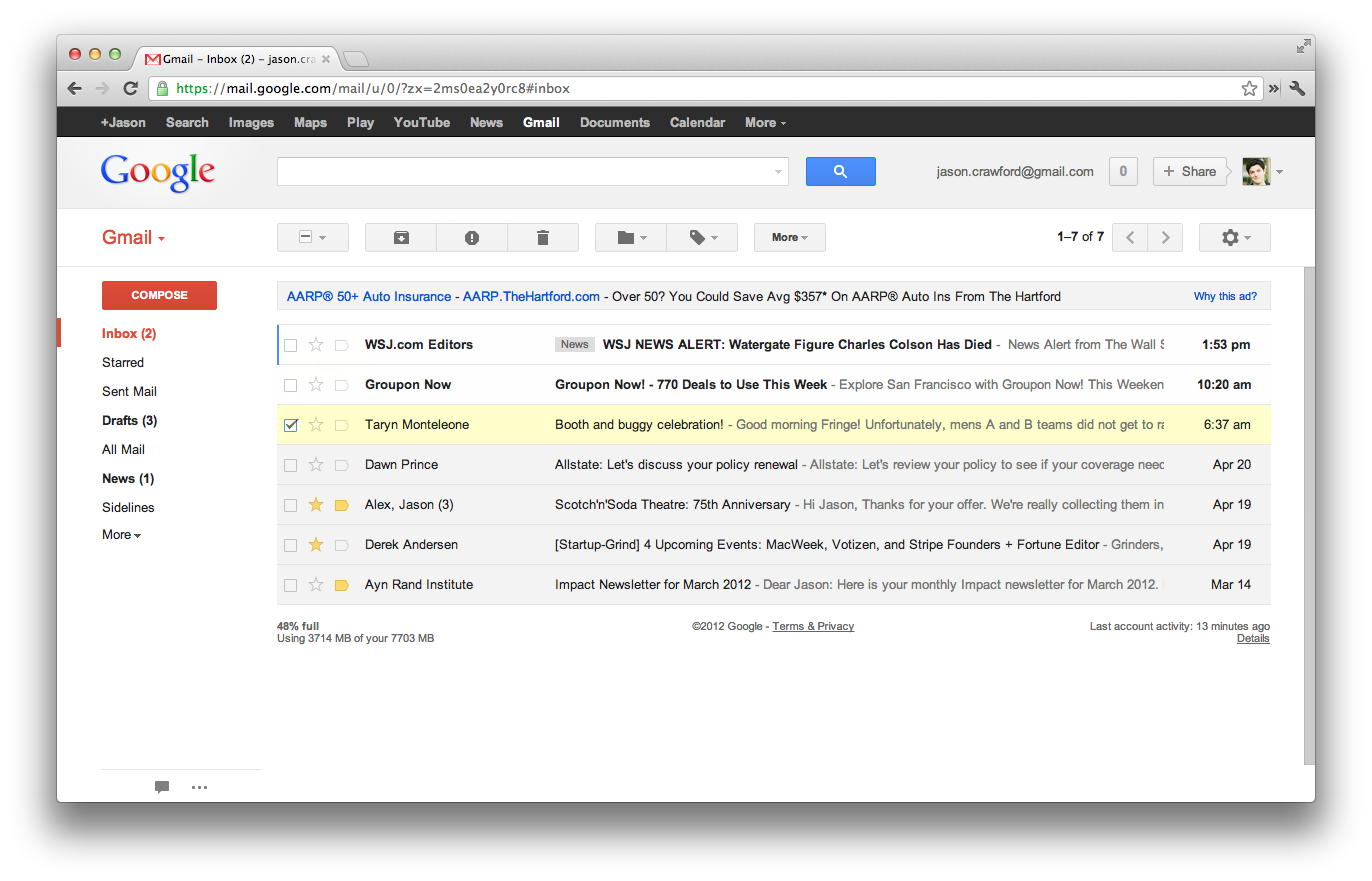
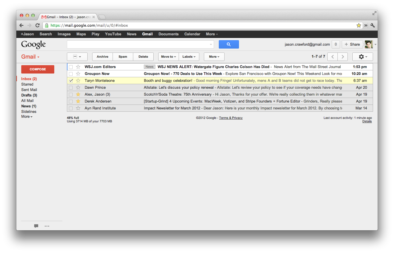
Net effect
Here's a before-and-after showing the net effect of these changes. Before:
After:
YMMV
These tips worked for me; some may not be ideal for you if you manage your email in a different way.
These days I do most of my writing at The Roots of Progress. If you liked this essay, check out my other work there.
Copyright © Jason Crawford. Some rights reserved: CC BY-ND 4.0
